***All the content is own by MAC Cosmetics
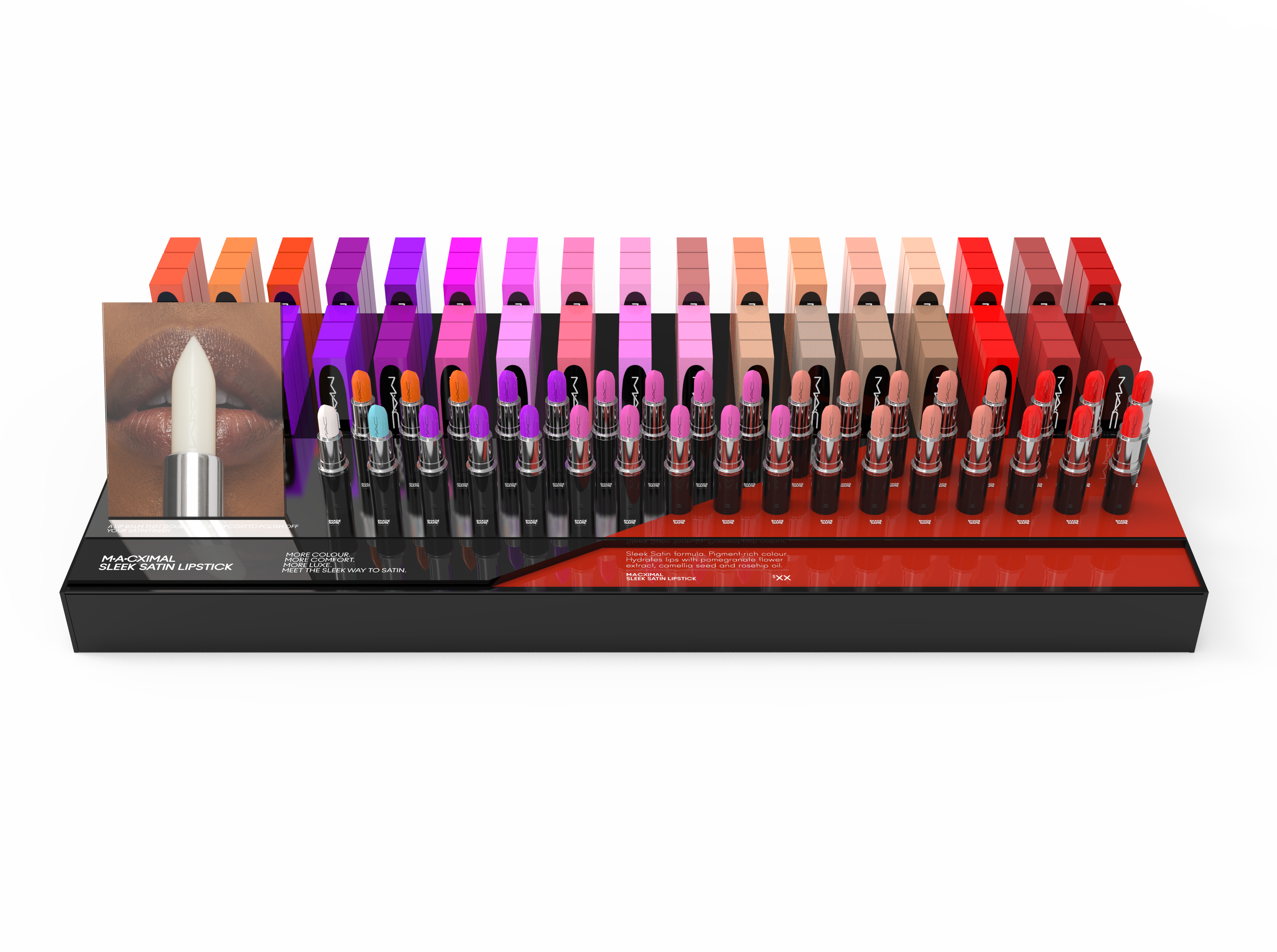
MACXIMAL SATIN Launch
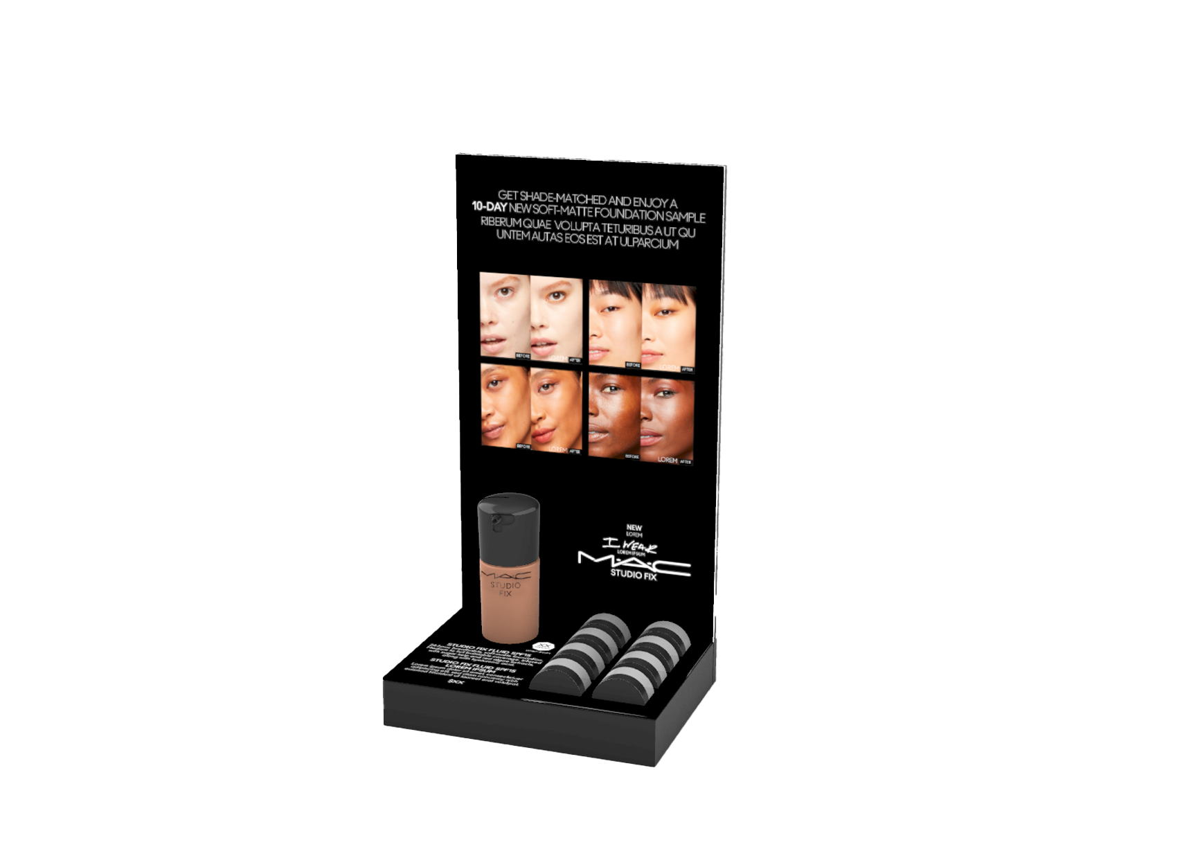
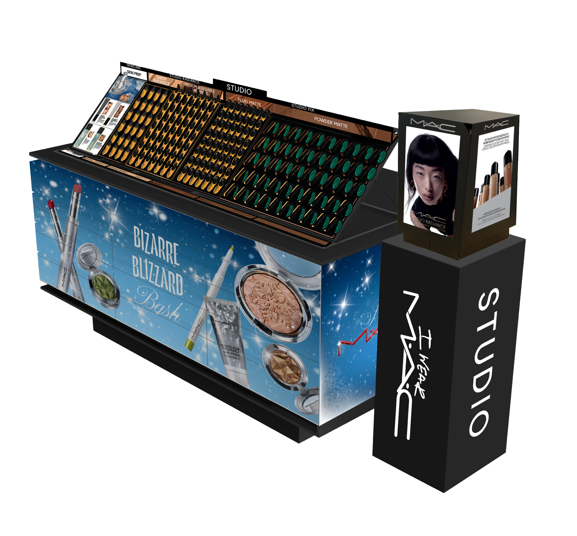
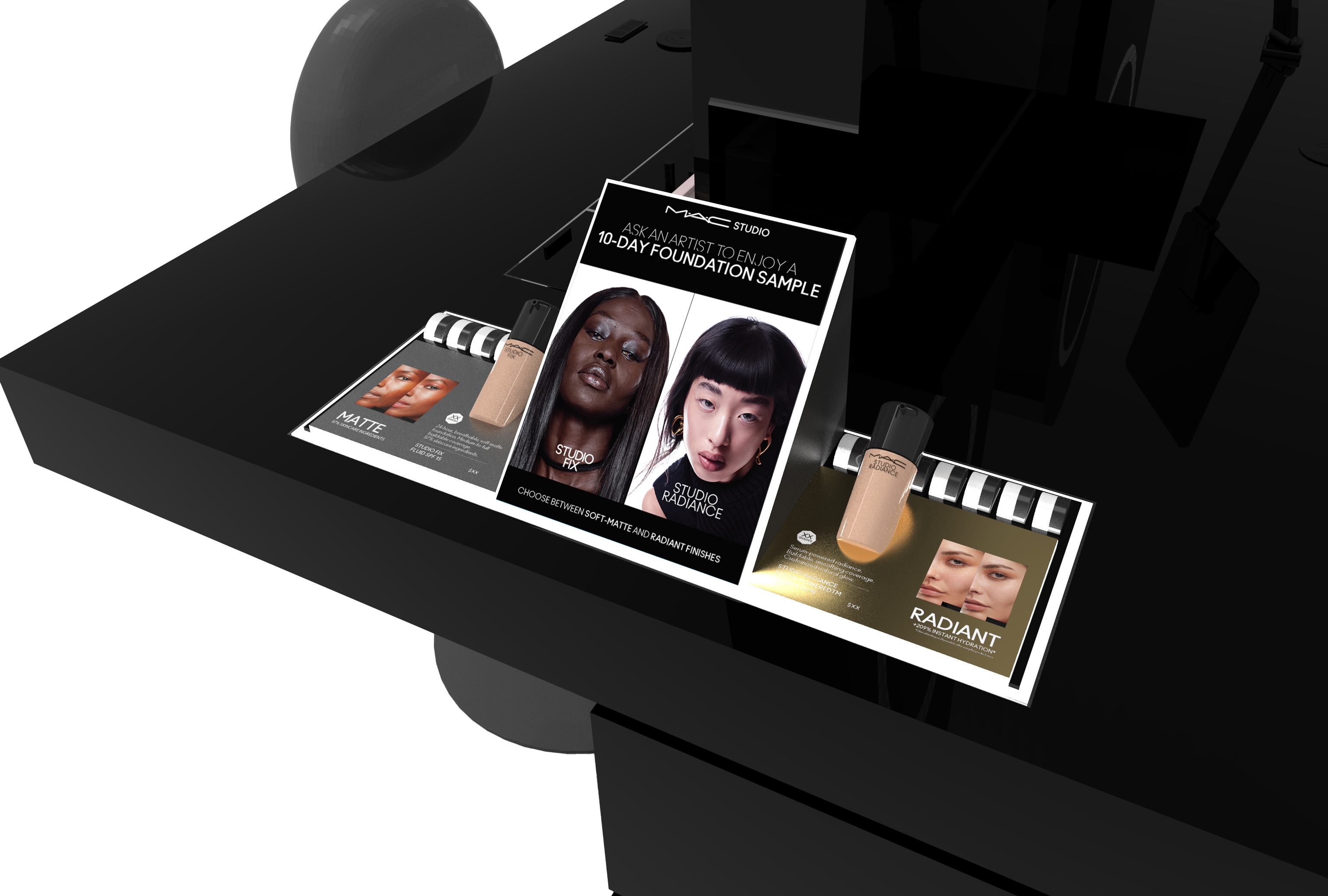
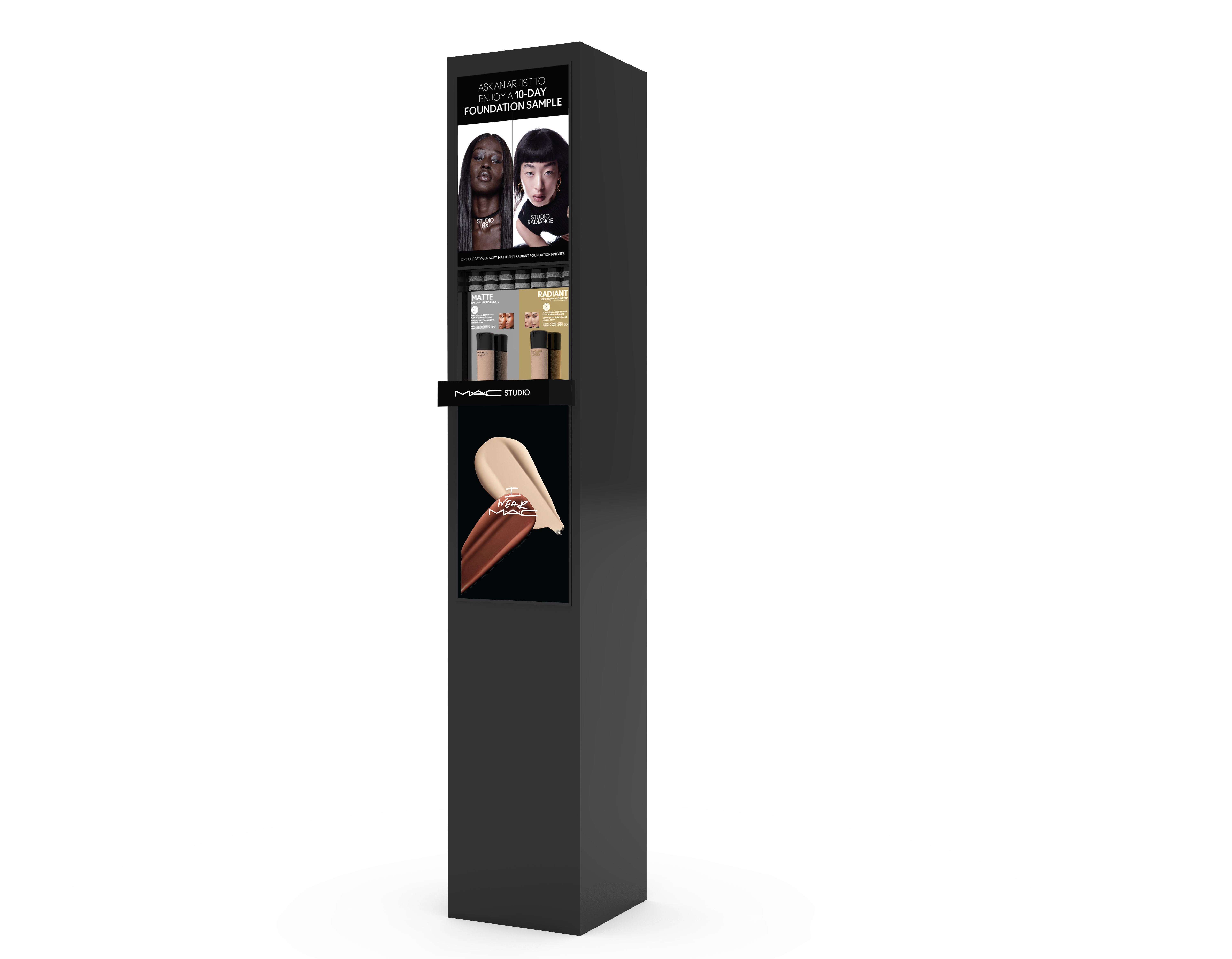
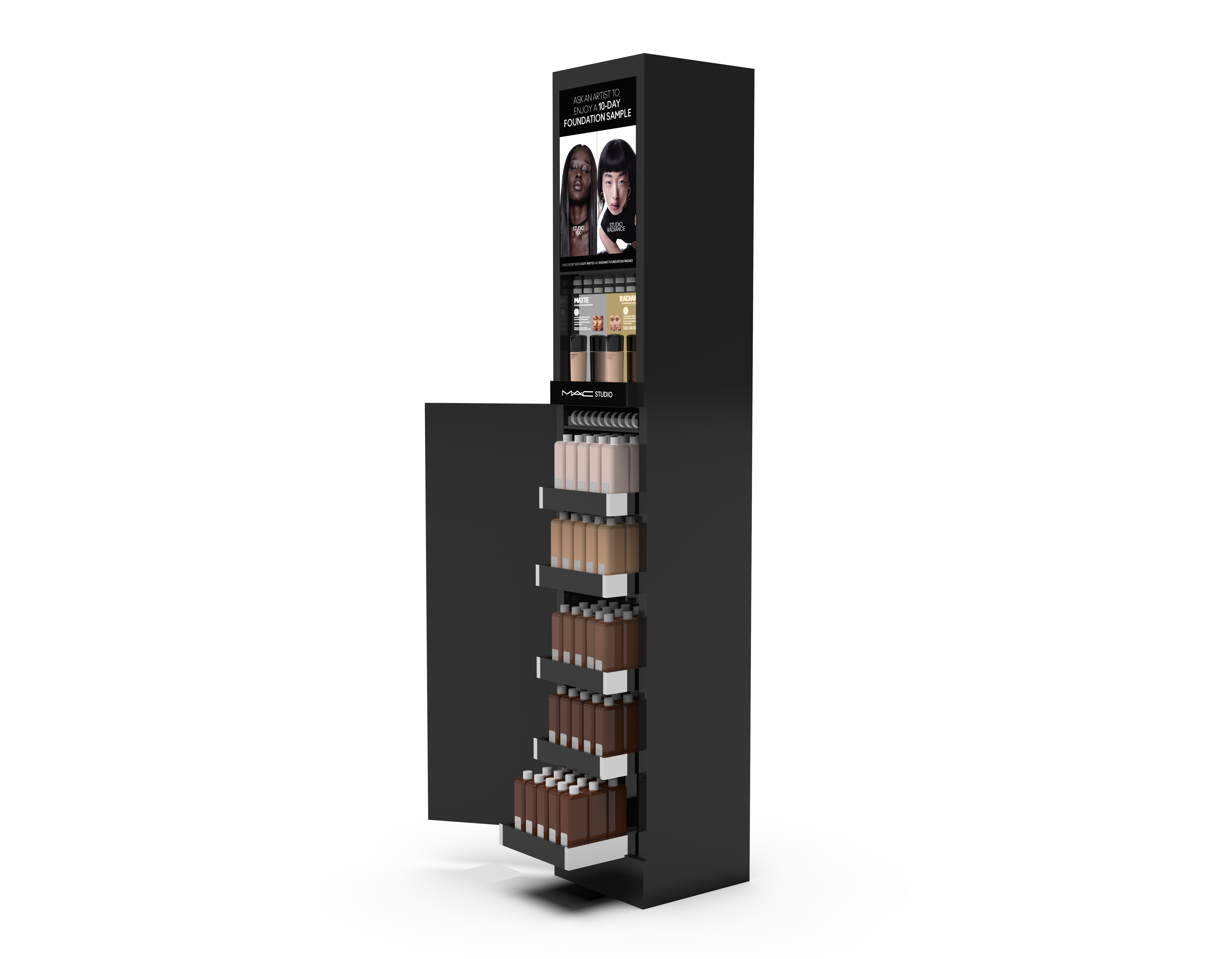
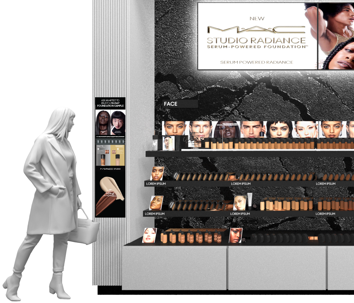
FOUNDATION DRAMMING


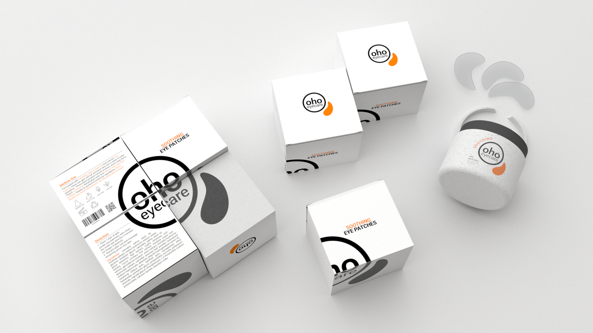
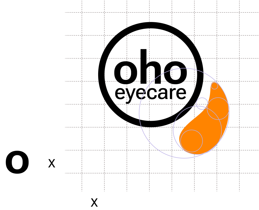
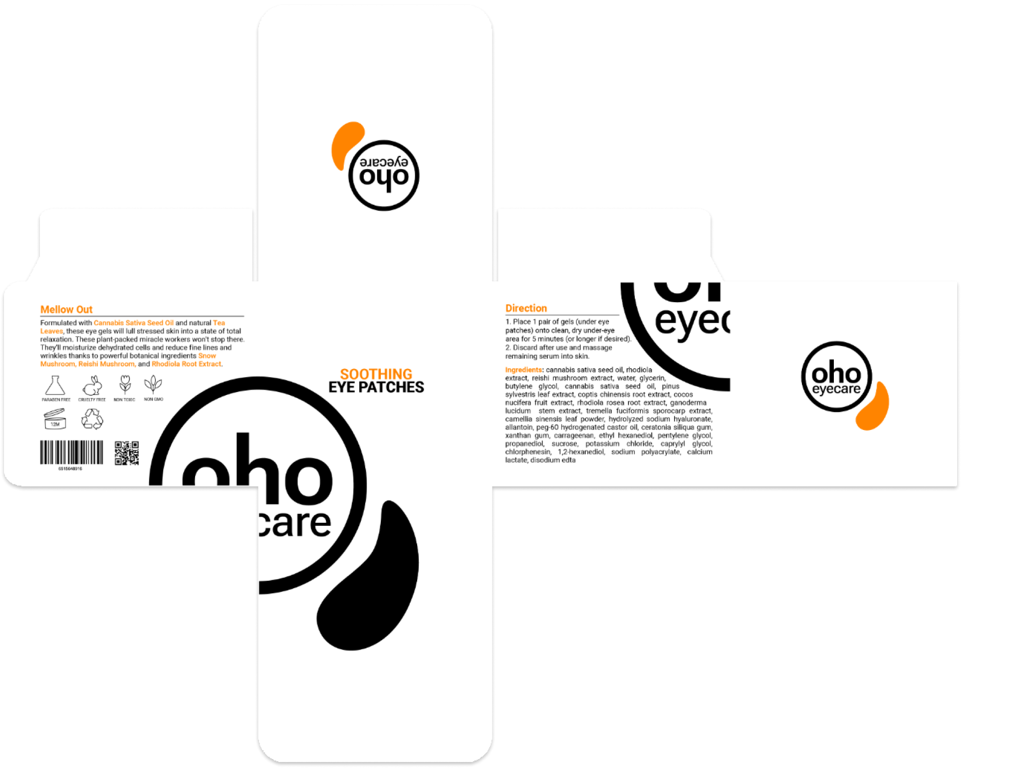
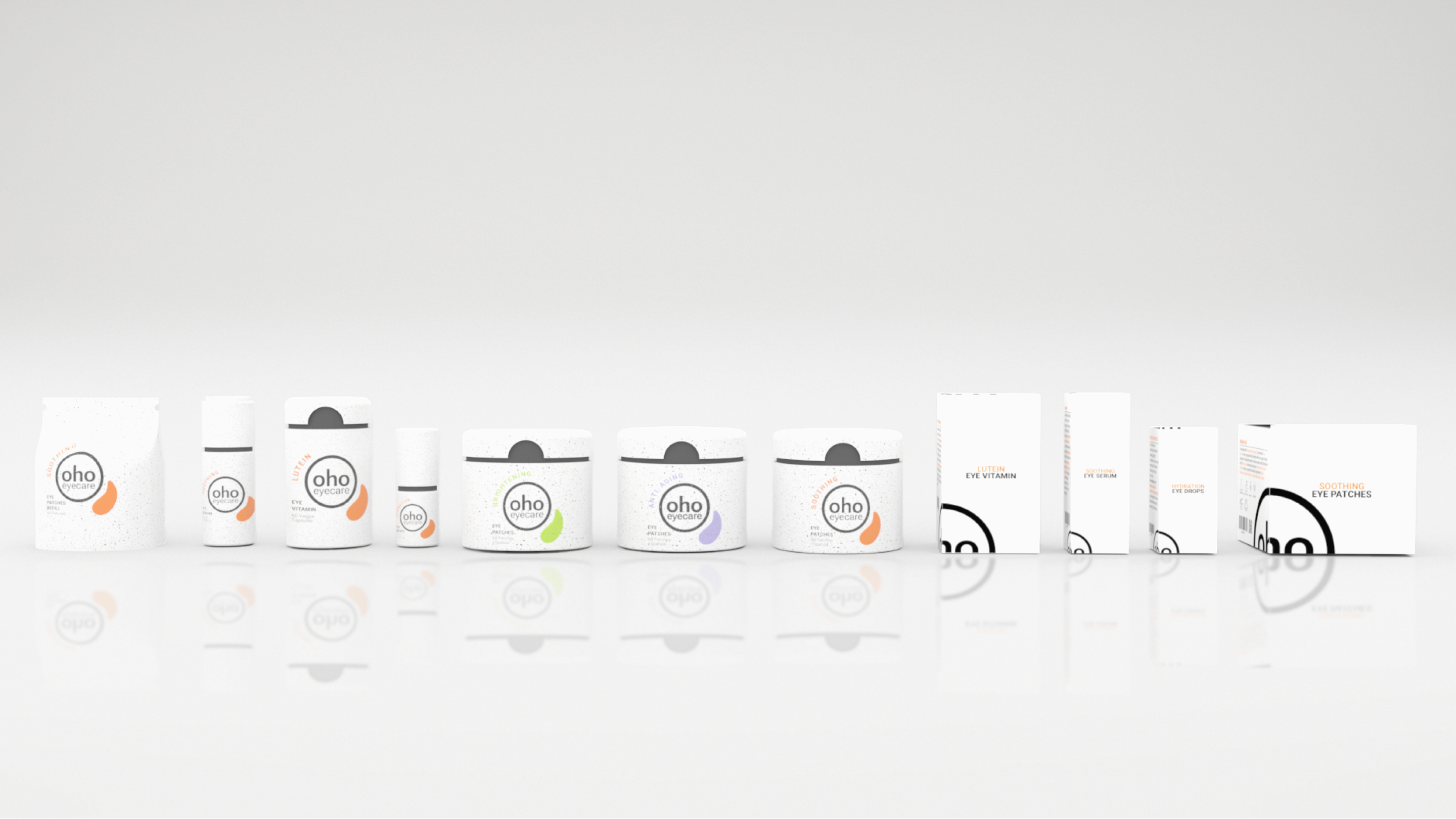
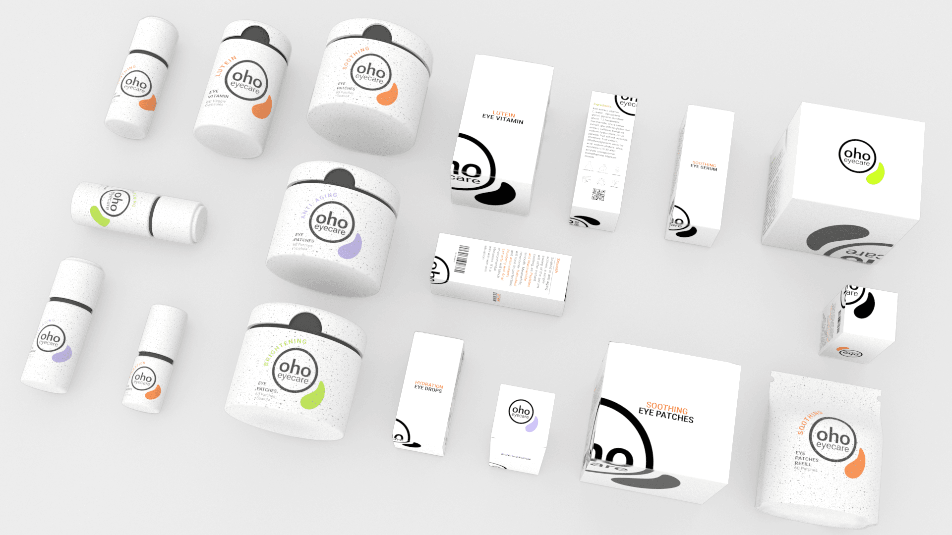
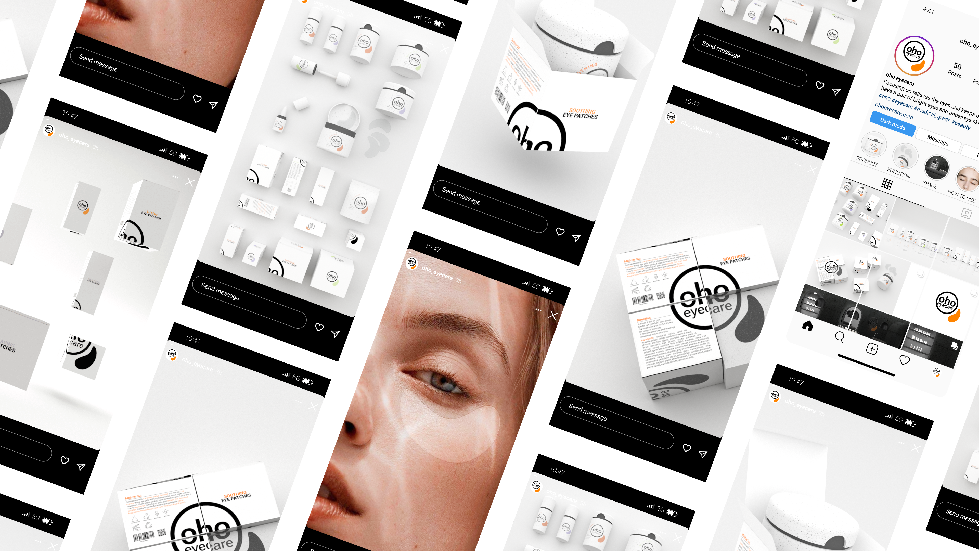
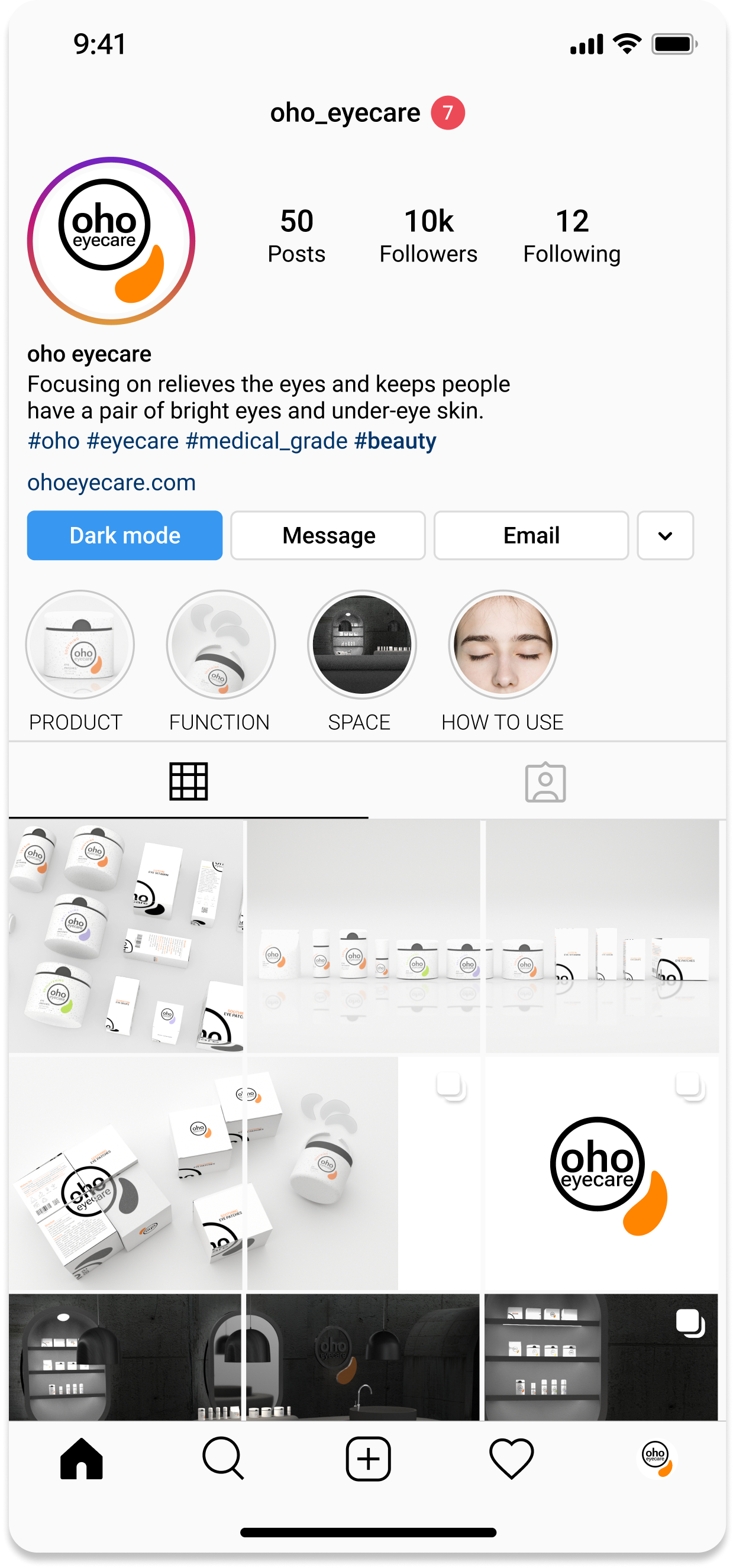
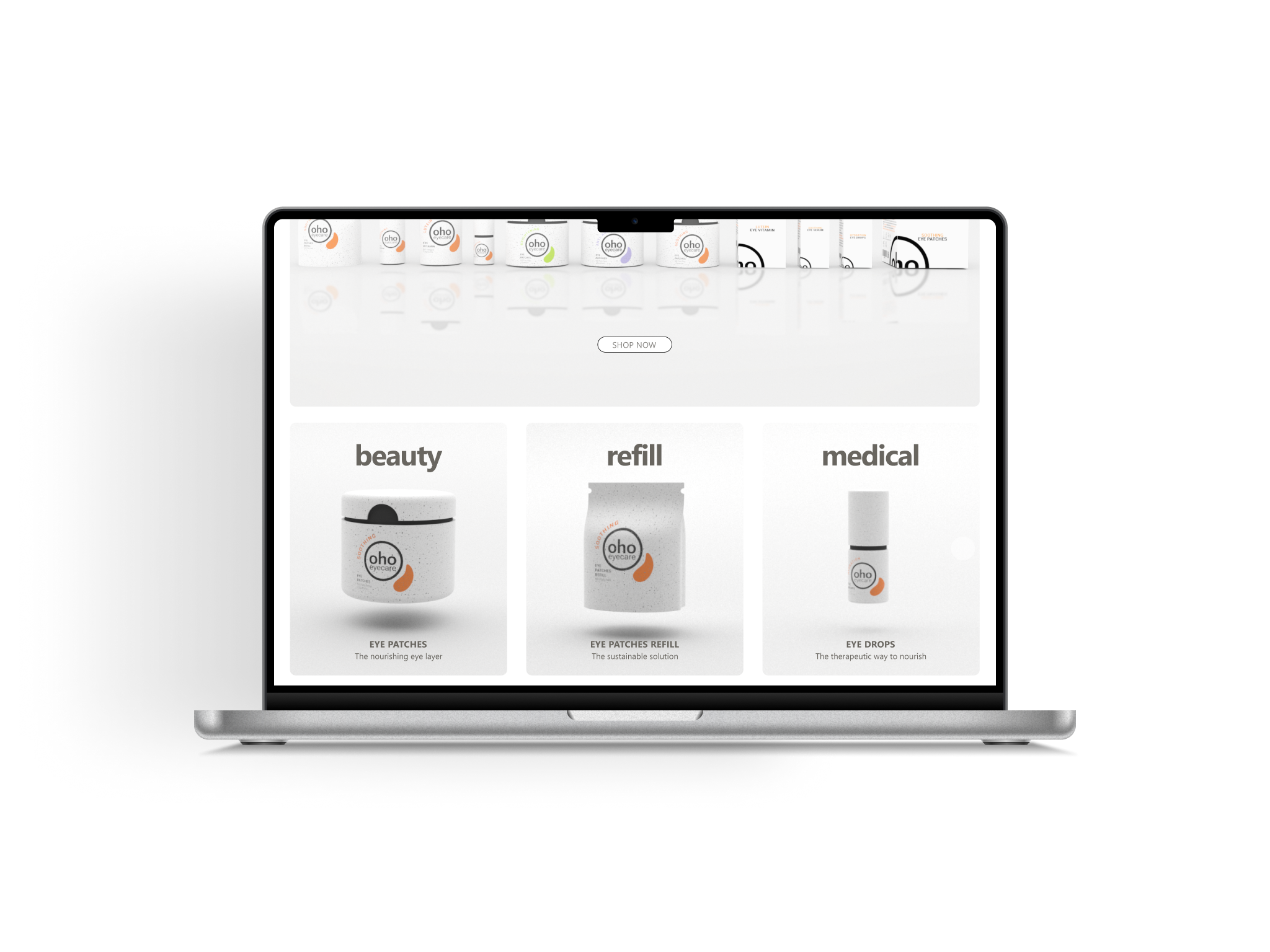
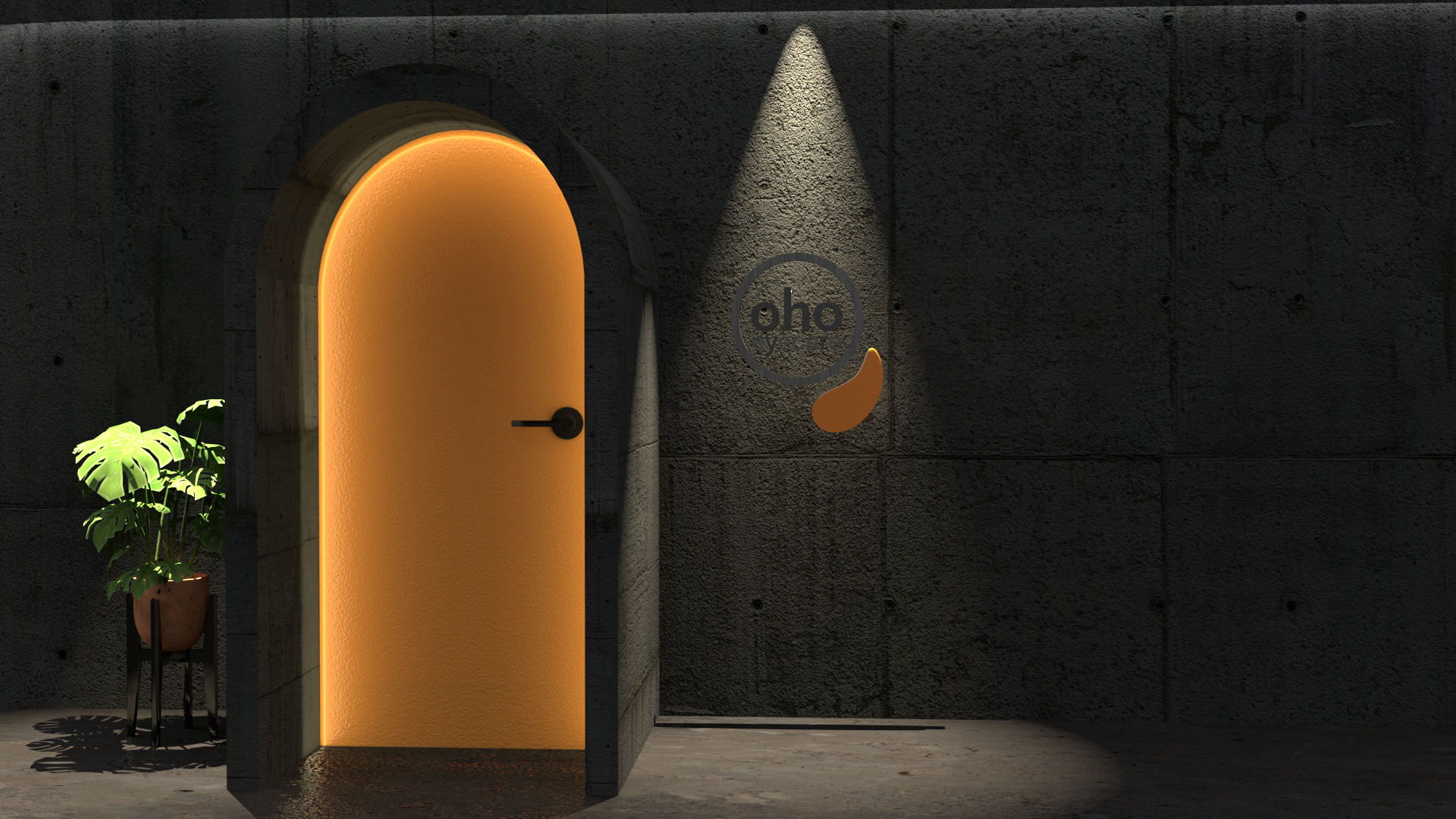
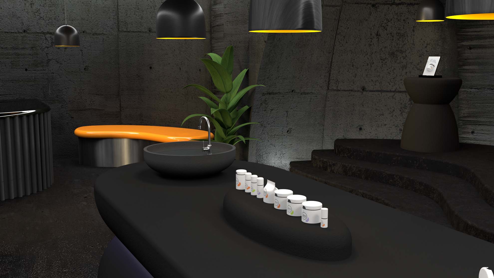
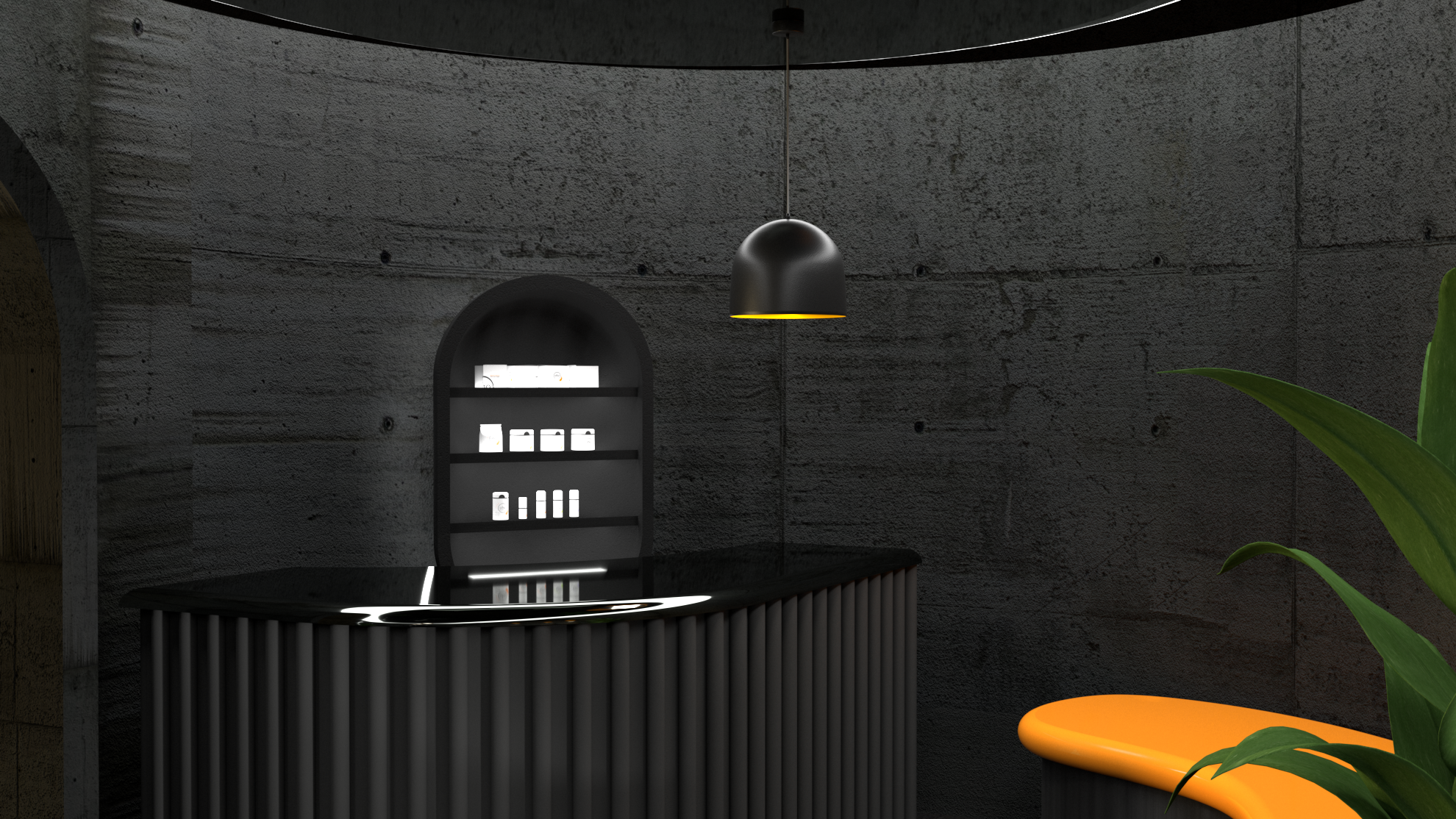
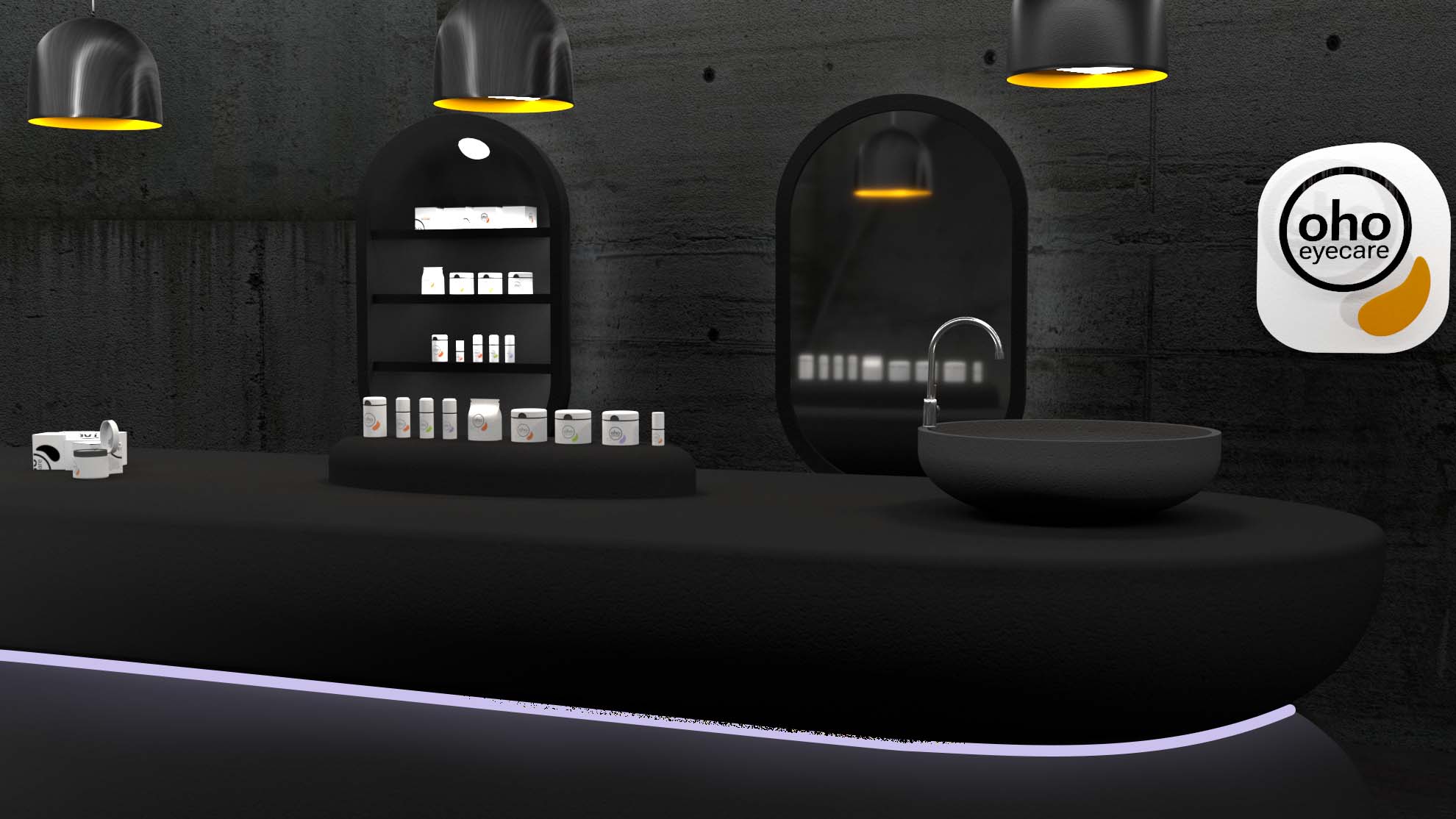
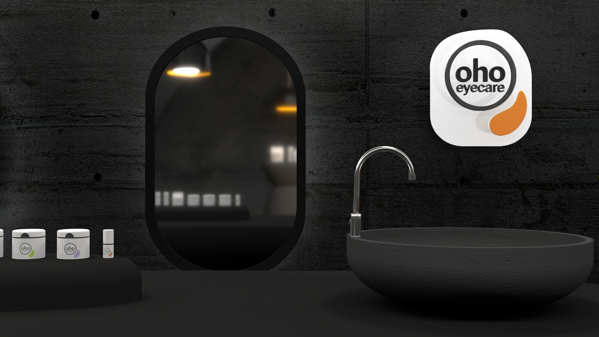
oho eyecare eye patches is a product focuses on relieving the eyes and keeping people have a pair of bright eyes and under-eye skin.
The unique attribute of product is an eye care combined with cosmetics and therapeutic.


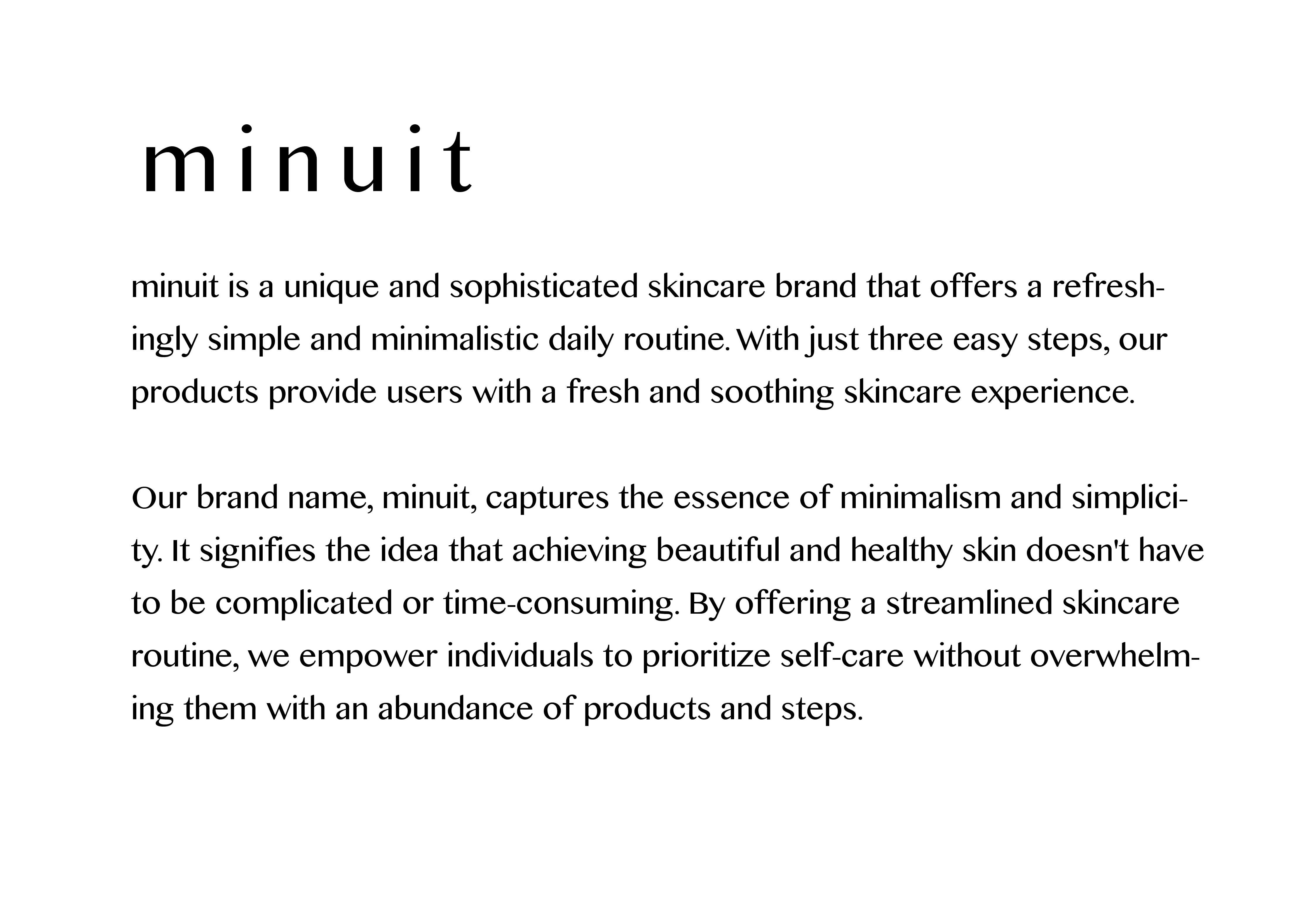
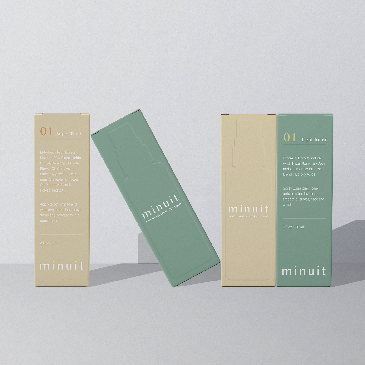
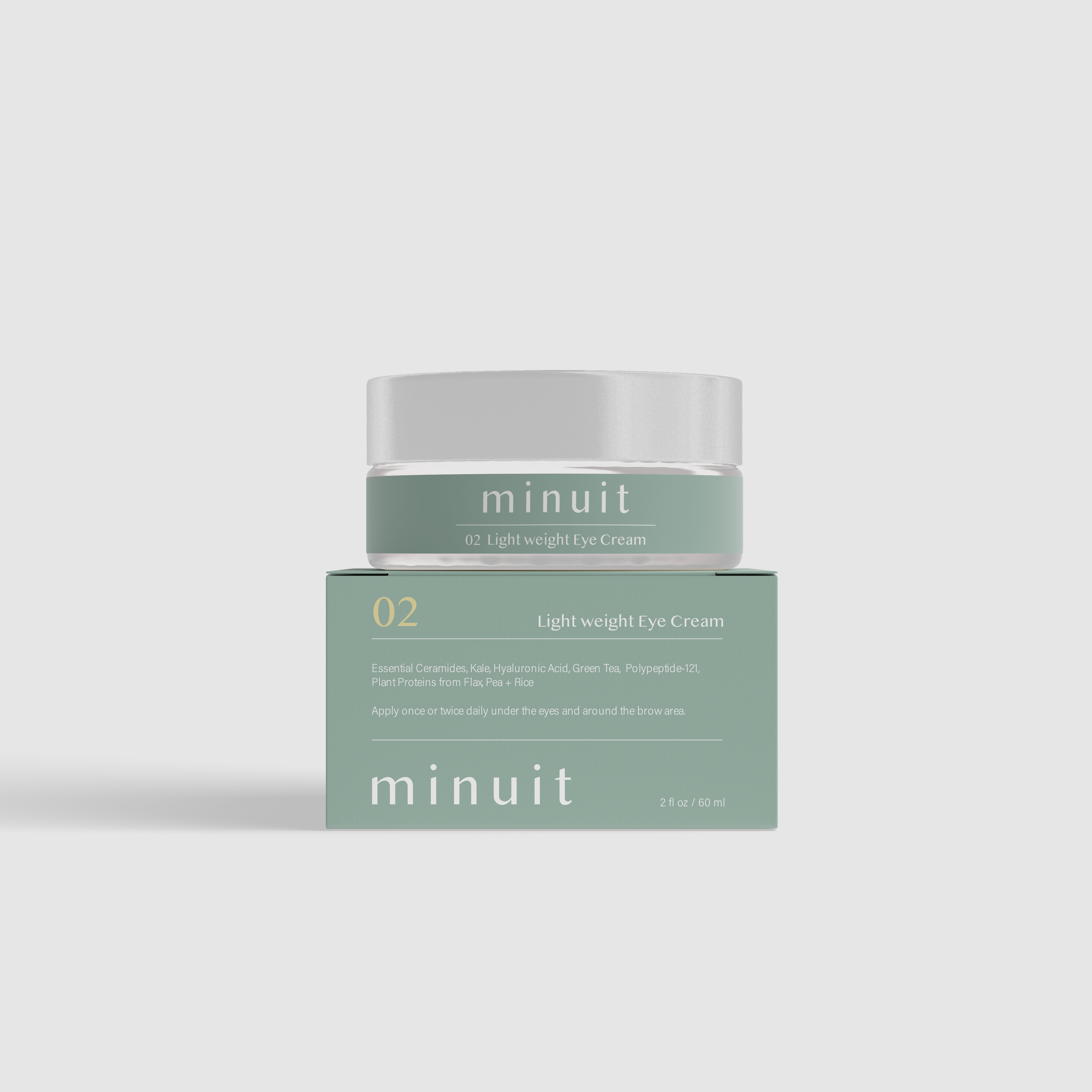
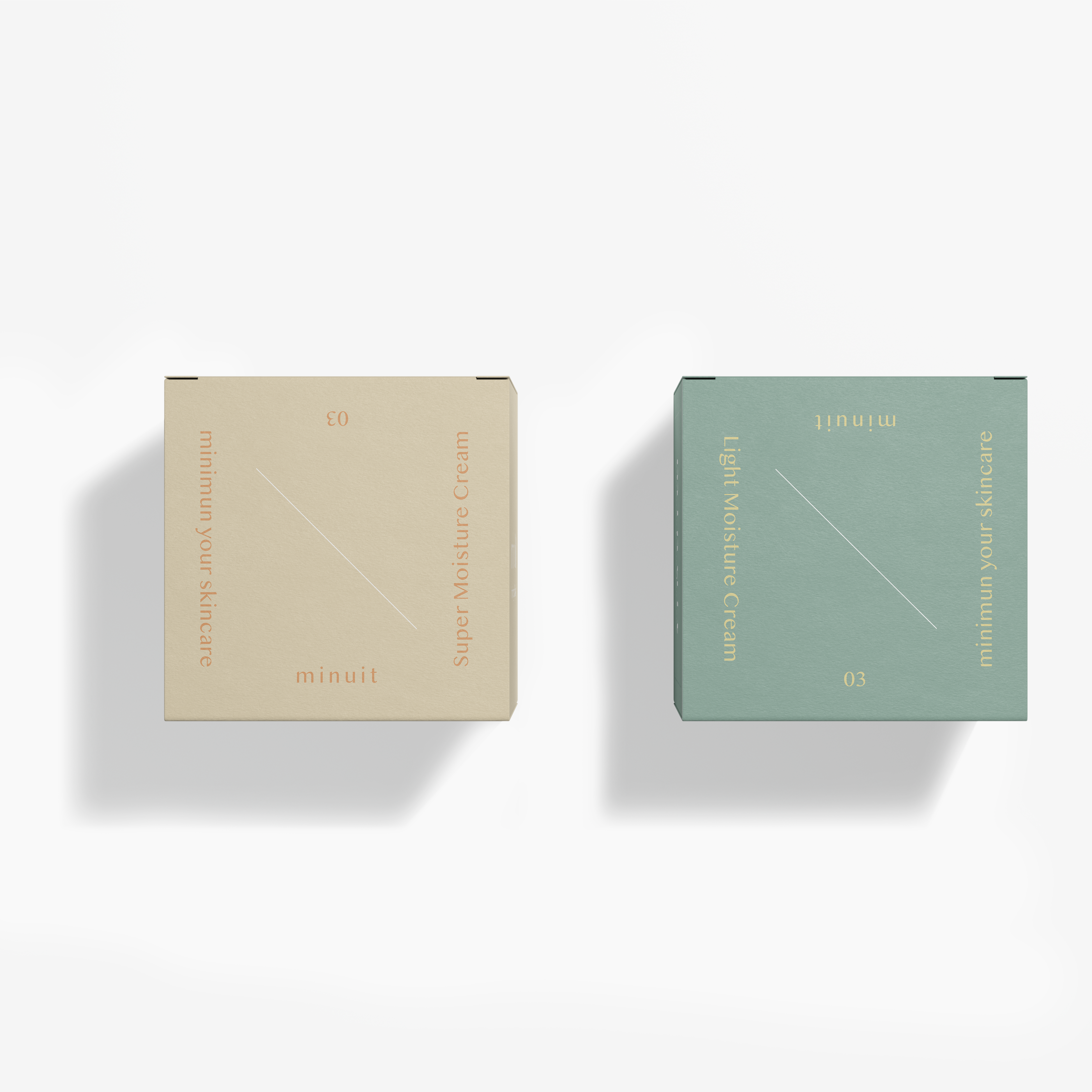
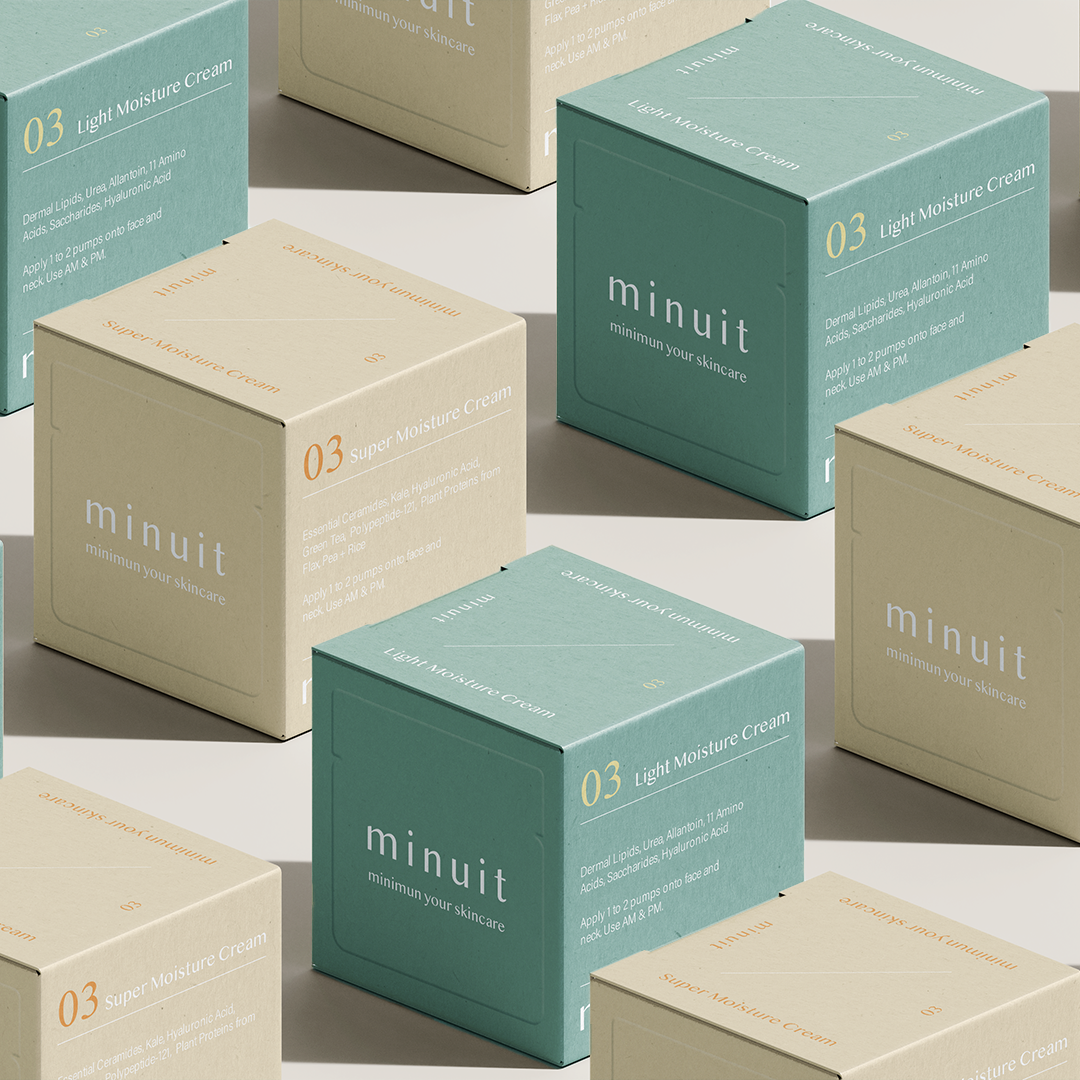
minuit is a unique and sophisticated skincare brand that offers a refreshingly simple and minimalistic daily routine. With just three easy steps, our products provide users with a fresh and soothing skincare experience.
Our brand name, minuit, captures the essence of minimalism and simplicity. It signifies the idea that achieving beautiful and healthy skin doesn't have to be complicated or time-consuming. By offering a streamlined skincare routine, we empower individuals to prioritize self-care without overwhelming them with an abundance of products and steps.
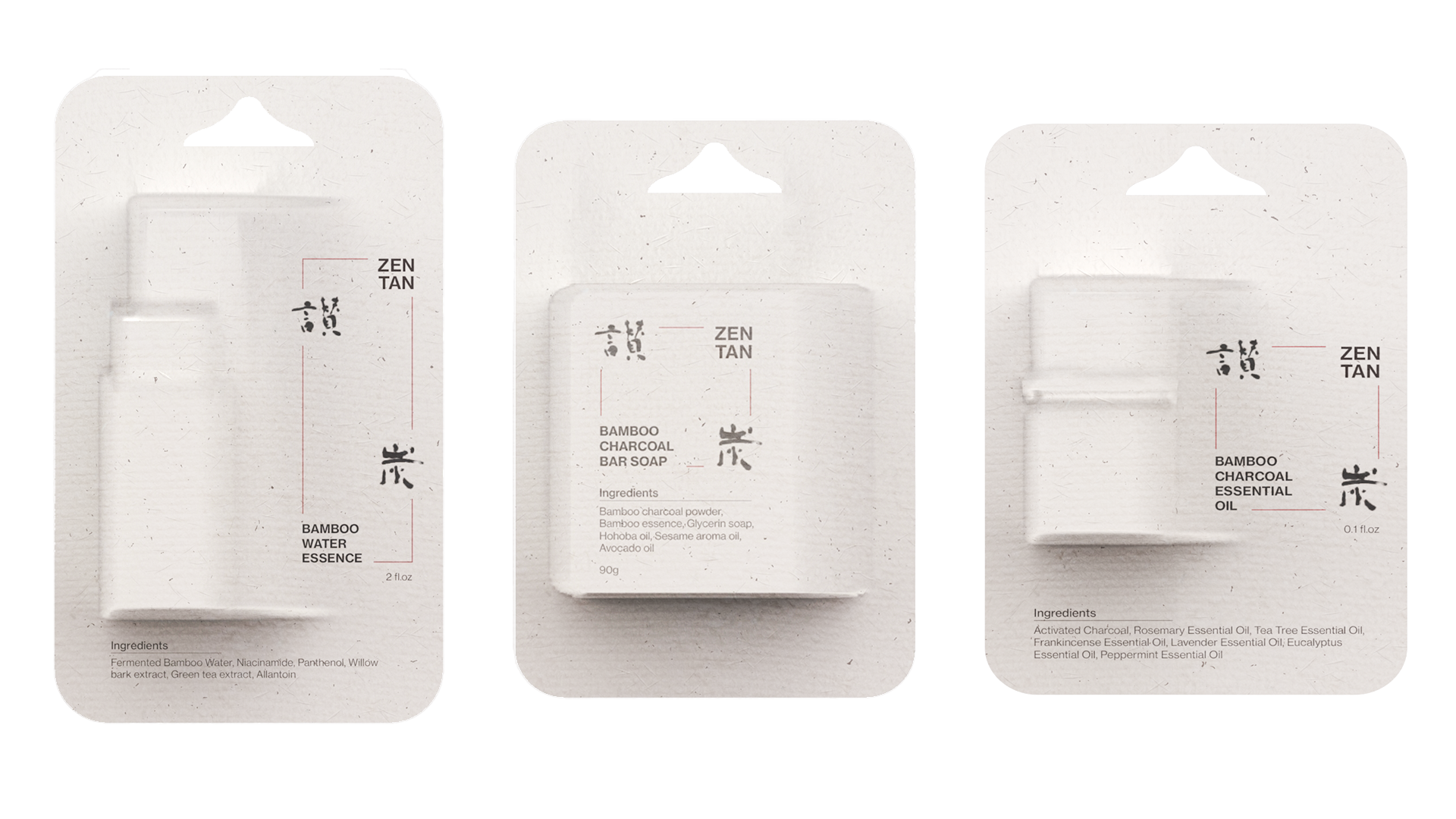
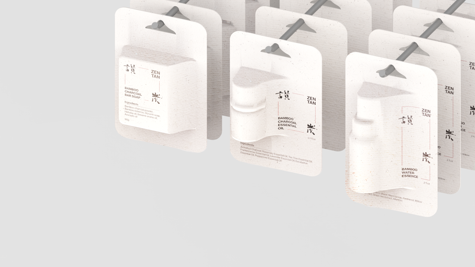
* The project is an internal branding project for Thinkpackage.


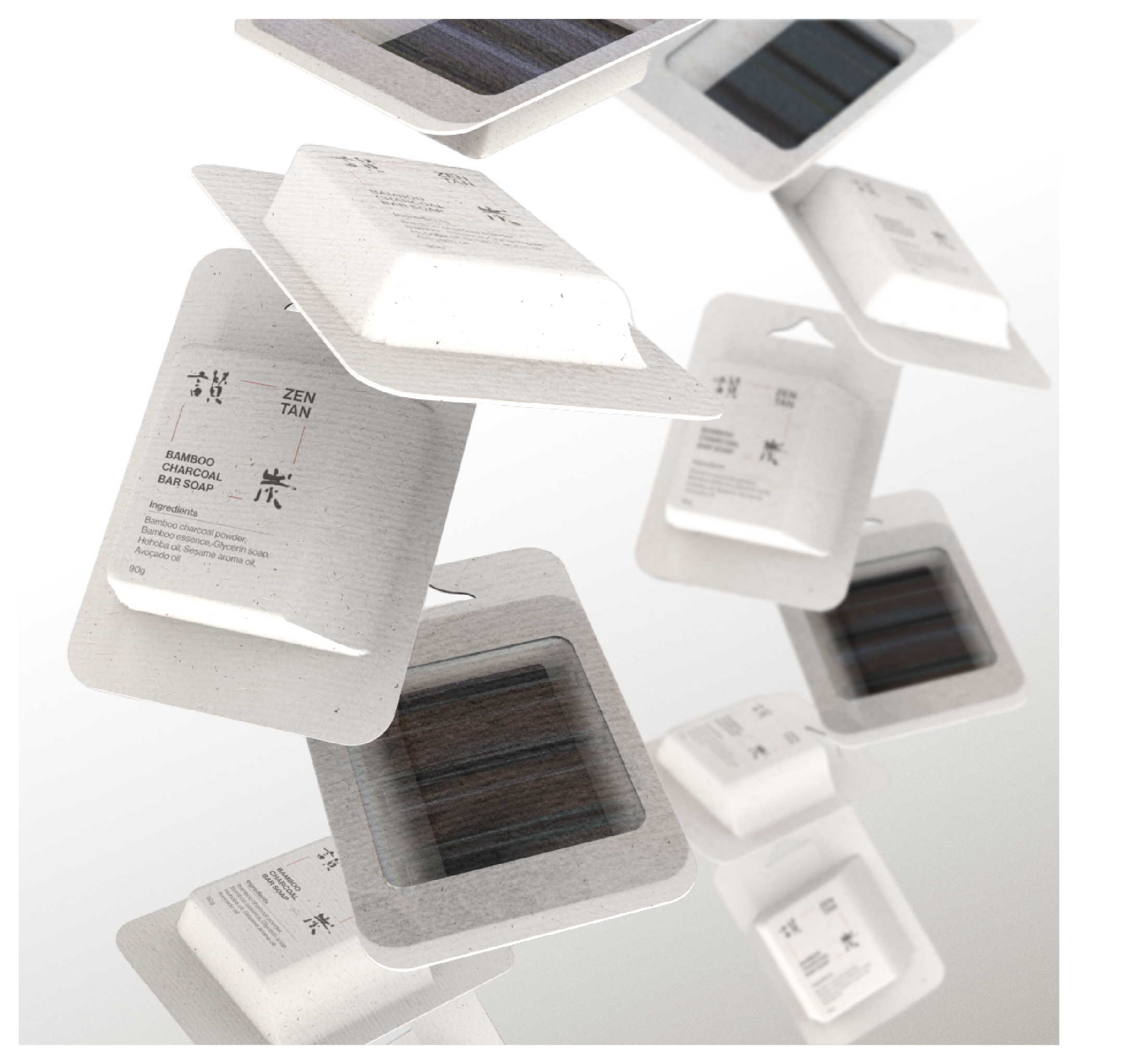
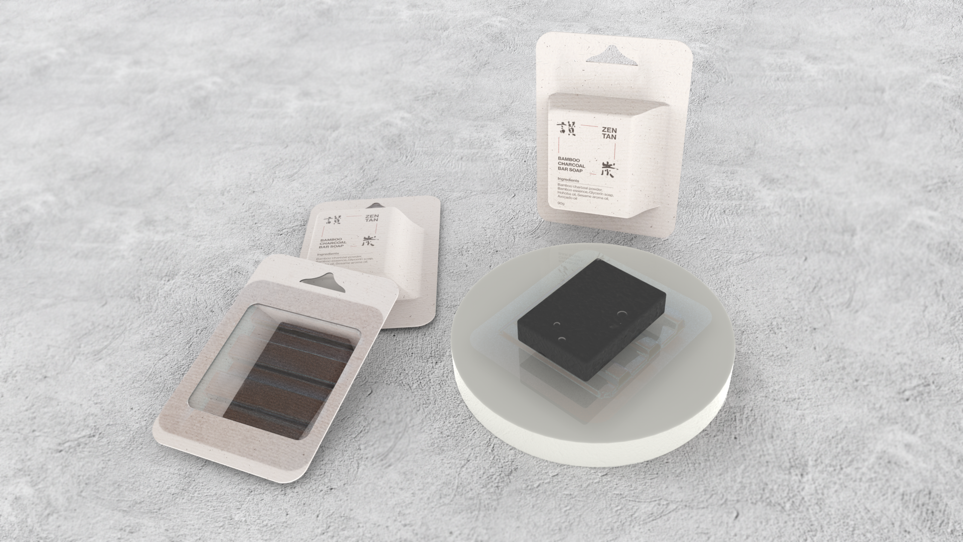
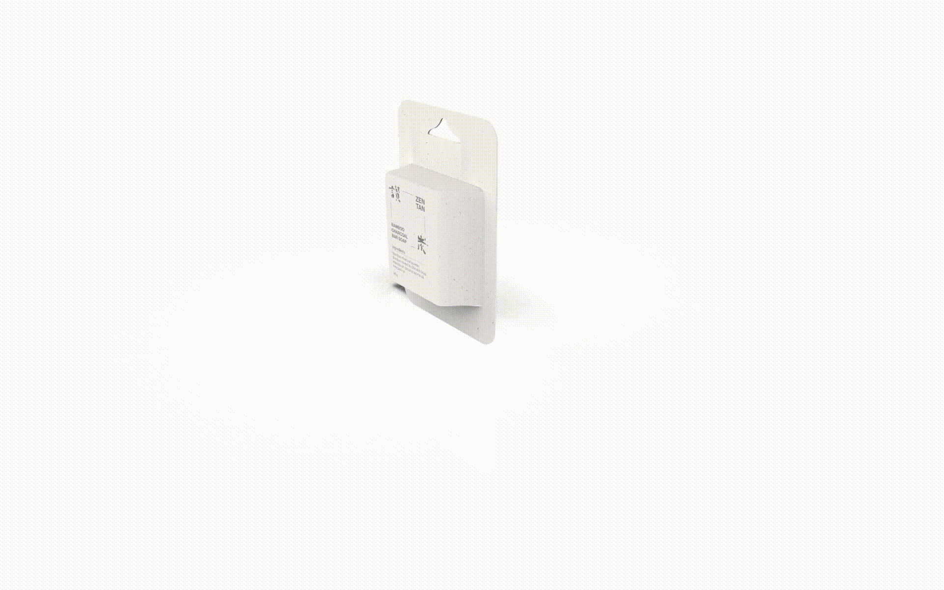
In Chinses, ZEN means gorgeous and Tan means coal.
ZEN TAN is a traditional local Taiwanese clean brand that focuses on creating a series of bamboo charcoal products.
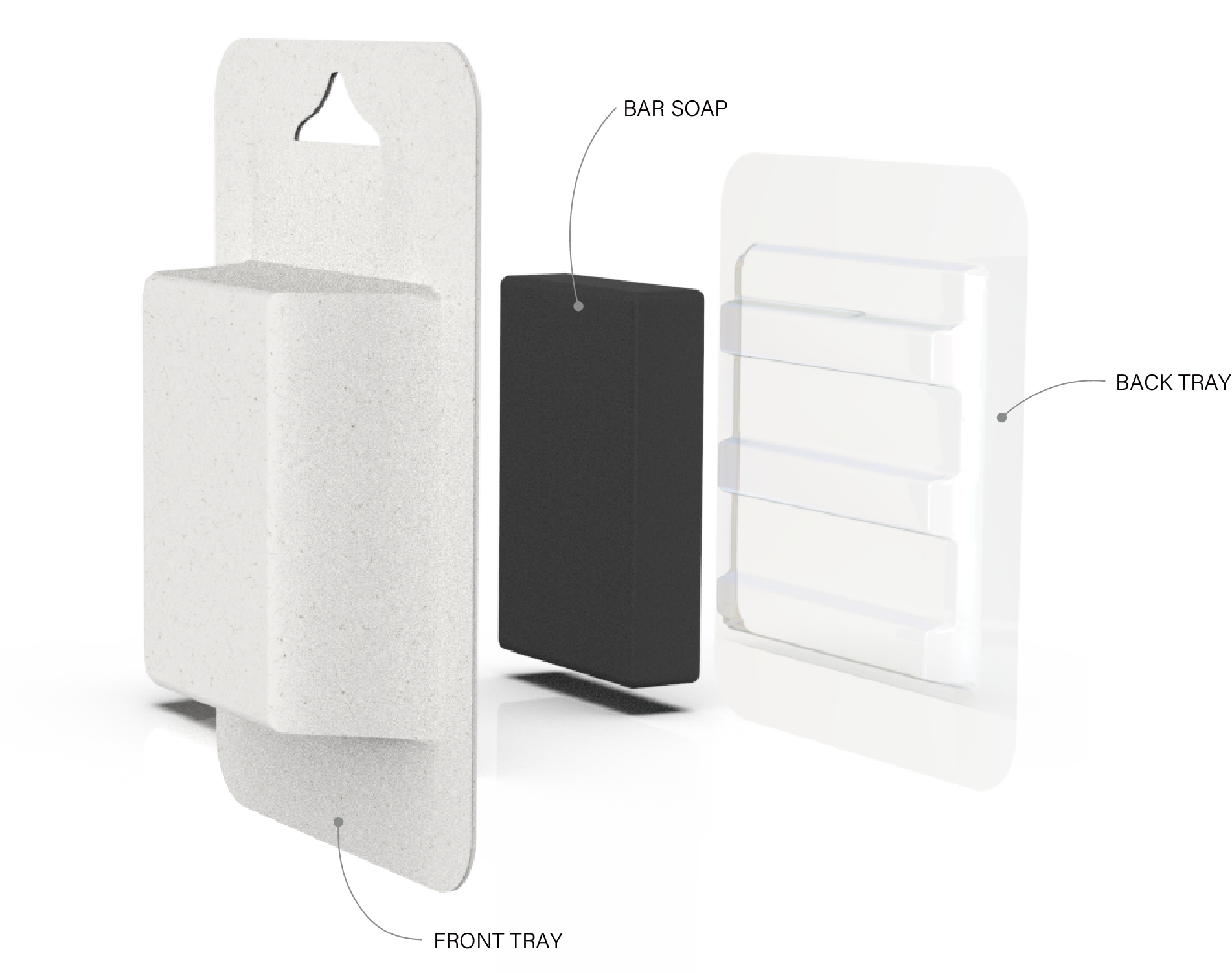
In this design, I focus on both rebranding and vacuum forming structures. In the form of the packaging, I transform the mountain impression into a boundless form to become the front tray. For sustainability, I applied the molded pulp to the front tray and recycled plastic to the back tray, which can have an after-use as a soap dish.